Value
Lightness differs.
PRINCIPLE 02 · DIFFERENCE
The perceptible degree of difference between visual elements.
Contrast can occur through value, color, scale, shape, texture, direction, type, density, or space. Black against white is only one strong example.
More is not automatically better. The useful amount depends on what must be distinguished, compared, read, or emphasized.
CONTROLLED DEMONSTRATION 01
Geometry and placement remain fixed. Only the value interval between the two squares changes.
CONTROLLED DEMONSTRATION 02
Each field contains five related units. One unit differs through the named variable only.
Lightness differs.
Size differs.
Contour differs.
Surface information differs.
Orientation differs.
CONTROLLED DEMONSTRATION 03
Both sequences use the same darkest and lightest values. Only the two middle values change.
MANIPULATE · ONE VARIABLE
The left form stays fixed. Choose one visual variable, then adjust only that variable on the right form.
Current comparison: value differs; the right square is lighter. Control setting 60 of 100.
DISTINCTION · DESIGN / ACCESSIBILITY
Design contrast can involve many variables. WCAG contrast ratio is a specific luminance-based measure applied to particular text and non-text requirements.
DESIGN CONTRAST
Value, hue, scale, contour, texture, direction, density, type, or space may establish contrast. Hue difference alone does not guarantee enough luminance contrast for text.
WCAG 2.2 · TEXT
Level AA requires at least 4.5:1 for normal text and 3:1 for large-scale text, with defined exceptions.
Read W3C Understanding SC 1.4.3WCAG 2.2 · NON-TEXT
A minimum 3:1 contrast is required for specified user-interface components and graphical objects needed to understand content.
Read W3C Understanding SC 1.4.11VOCABULARY
Identify both the variable that differs and where the difference occurs.
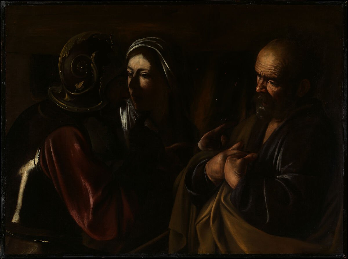
ANALYZE · LOCAL VALUE CONTRAST
Begin with observable differences. Bright faces, hands, and cloth meet a field that is largely very dark. The strongest local value changes make selected gestures and expressions easier to distinguish without requiring every part of the canvas to be equally different.
Rights: the Met identifies the work and image as Public Domain and provides it through Open Access.
View the official Met object recordCHECK UNDERSTANDING
No. It is one example of high value contrast. Contrast can occur through many visual variables and at low, moderate, or high degrees.
No. Their darkest and lightest endpoints match. The central neighboring values create the difference.
No. Accessibility criteria for text use a calculated relative-luminance contrast ratio; different hues can still be too similar in luminance.
CONNECT