Hue
A named color family, such as red, yellow, green, blue, or violet.
ELEMENT 07 · COLOR
Color begins with light and becomes an experience of hue, value, intensity, relationship, and context.
Color depends on both material and context. Pigment, emitted light, printing ink, and digital coordinates organize color through different models.
Choose the model for the material: no single wheel or interface describes every color system.
INTERACTIVE STUDY 01
Choose a hue, drag the BASE handle around the wheel, and compare how its relationships change.
Drag the BASE handle around the wheel, click a hue, or use the slider.
Two hues opposite each other on the wheel.
Base: Red · Complement: Green
EXPLORE A PRECISE COLOR
Hue identifies the color family. Saturation and lightness change its appearance without changing its position in the hue relationship.
Move horizontally for saturation and vertically for lightness.
Enter a three- or six-digit hexadecimal color beginning with a number sign.
ORIENTATION
Color is not a single diagram. Artists may organize pigment relationships with a traditional wheel; screens mix red, green, and blue light; printing combines cyan, magenta, yellow, and often black; digital interfaces may describe a color through hue, saturation, and lightness. Each model answers a different question.
A named color family, such as red, yellow, green, blue, or violet.
The relative lightness or darkness of a color.
The intensity or purity of a hue compared with a grayer version of it.
PRIMARY
In this traditional artist’s model, primary colors serve as starting hues and are not made by mixing the model’s other hues.
SECONDARY
Secondary colors are made conceptually by mixing two neighboring primary colors: red + yellow, yellow + blue, or blue + red.
TERTIARY
Tertiary positions sit between a primary and a neighboring secondary, producing names such as red-orange and blue-green.
CONTROLLED DEMONSTRATION 01 · MODELS
These systems are related, but they are not interchangeable. The diagrams describe different materials and purposes.
LIGHT · ADDITIVE
Displays add red, green, and blue light. More combined light moves toward white.
INK · SUBTRACTIVE
Printing inks absorb portions of reflected light. Black is commonly added for density, detail, and practical reproduction.
INTERFACE · DESCRIPTION
A screen-oriented way to select hue, saturation, and lightness. HSL lightness is a mathematical interface value, not a universal measure of perceived brightness or pigment value.
CONTROLLED DEMONSTRATION 02 · TEMPERATURE
On this wheel, reds, oranges, and yellows form a commonly described warm region; greens, blues, and violets form a commonly described cool region. The boundary is not absolute: a violet can appear cooler beside orange and warmer beside blue-green. “Warm” and “cool” are relational descriptions, not guarantees of universal emotion.
CONTROLLED DEMONSTRATION 03 · CONTEXT
The two center squares below use the same violet. Their surrounding colors alter the apparent relationship, demonstrating that color is perceived in context rather than in isolation.
CENTER COLOR · IDENTICAL IN BOTH FIELDS
Try this relationship with your own palette. Open Color in Context
VOCABULARY
HISTORICAL LENS · JOHANNES ITTEN
At the Bauhaus, Johannes Itten used a twelve-hue circle and exercises in color contrast as part of an influential foundation course. His system is useful for comparing pigment relationships and became important in design education, but it is one historical framework among several, not a complete scientific account of color.
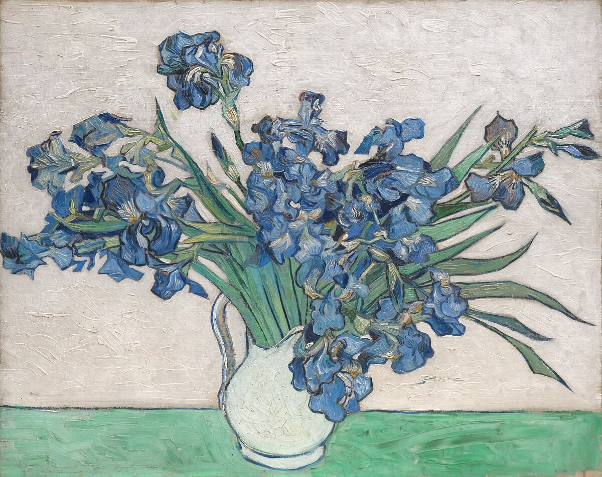
ANALYZE · COLOR IN CONTEXT
Observe: violet-blue flowers repeat across a pale field; yellow-orange centers and green stems create smaller contrasting events. The Met notes that the original pink background has faded because of fugitive red pigments.
Analyze: rather than assigning a fixed emotion to violet or green, trace how neighboring hues, repeated accents, and unequal areas establish relationships across the surface.
Transfer: choose one dominant field, one recurring family, and one limited accent. Test whether the hierarchy survives when the accent changes hue.
CHECK UNDERSTANDING
You need to predict how colored light combines on a display.
Use RGB.You need to locate a complementary pigment relationship on this traditional wheel.
Use the RYB relationship map.You need to specify ink separations for commercial printing.
Use CMYK.You need to adjust one screen color through interface coordinates.
Use HSL, but understand its limitations.