Character
An abstract unit of writing, such as the letter A.
ELEMENT 09 · LANGUAGE AS VISUAL FORM
The deliberate selection, arrangement, and shaping of written language as visual form and information.
Typography organizes words through letterform, scale, weight, spacing, measure, alignment, placement, and contrast. These relationships influence reading order and the character of a message.
About this framework: this site includes Typography as its ninth Element because it addresses both art and design. Not every art curriculum classifies typography as an Element of Art.
ORIENTATION · SYSTEM AND INSTANCE
Separating the abstract symbol, its visible form, the designed family, and the usable resource makes typographic decisions easier to describe.
An abstract unit of writing, such as the letter A.
A particular visual representation of a character.
A designed system of related letterforms.
A usable instance or resource of a typeface in a style, weight, or width.
CONTROLLED DEMONSTRATION 01 · ANATOMY
The specimen is locked to bundled DejaVu Serif. Violet isolates the named part of each glyph; leader lines confirm the exact target.
A principal vertical or diagonal stroke of a letterform.
A finishing stroke extending from a main stroke.
A curved stroke that encloses or partly encloses a counter.
The enclosed negative space within this letterform.
The lowercase portion that extends above the x-height.
A curved stroke projecting from a stem.
The dot above a lowercase i or j.
The lowercase portion that extends below the baseline.
Cap height is the height reached by a flat-topped capital such as H.
X-height is the height of the main lowercase body, conventionally shown with x.
Baseline is the line on which most letters sit.
Descender line marks the lower extent used here; the descender is the glyph portion below the baseline.
Ascender is the lowercase portion above x-height. It is not another name for cap height.
CONTROLLED DEMONSTRATION 02 · CLASSIFICATION
Serif, sans serif, and slab serif describe visible construction. Monospace describes a spacing system. Script/hand describes a broad formal source. Display usually describes intended use or character, not a mutually exclusive structural class.
Finishing strokes project from major strokes.
Major strokes end without serifs.
Heavy, often block-like serifs visibly shape the construction.
Characters occupy a shared advance width; this describes spacing as much as form.
Forms may draw from written or gestural models, with many distinct subcategories.
A use-oriented label for type intended to attract attention at larger sizes; it can also be serif, sans, script, or another structure.
CONTROLLED DEMONSTRATION 03 · SPACING
The violet marks identify exactly what changes in each comparison.
Adjustment of spacing between a particular pair of glyphs.
Consistent spacing adjustment across a range of characters.
Vertical spacing between lines of type, conventionally measured from baseline to baseline.
CONTROLLED DEMONSTRATION 04 · TEXT BLOCKS
Line length is contextual. Typeface, size, language, leading, medium, and reading conditions all affect a useful measure. Alignment is also a decision, not a universal quality ranking.
Typography gives language visible sequence. A narrow measure produces frequent line returns and a tall text block.
May suit small labels or narrow columns; frequent returns can interrupt longer reading.
Typography gives language visible sequence. A moderate measure can support sustained reading when type size and leading are coordinated with the column.
One useful relationship in this example, not a universal numerical rule.
Typography gives language visible sequence. A wide measure can reduce line breaks, but the return from one long line to the next may require more navigation.
May be useful for display text or short passages; context determines the tradeoff.
A shared left edge and variable right edge support predictable entry points.
A central axis may suit short, distinct units; changing line starts can slow longer reading.
Aligned edges can create a strong block, but spacing must be managed to avoid disruptive gaps.
MANIPULATE · HIERARCHY
The message stays fixed. Adjust the headline’s size, weight, and tracking to see how it separates from the deck, body, caption, and metadata.
Type creates order before a sentence is read.
Size, weight, position, spacing, and contrast can distinguish levels of information while keeping them connected.
Current headline: 92px, weight 700, tracking −4px. It is clearly dominant over the deck and body.
CONTEXT · TYPOGRAPHIC VOICE
Historical association, medium, audience, language, surrounding imagery, and repeated use all shape interpretation. Avoid formulas such as “serif means traditional” or “sans serif means modern.”
In this example, high contrast strokes and generous spacing may suggest an editorial or formal register.
In this example, heavy sans-serif capitals and tight spacing may read as direct and compressed.
In this example, monospaced forms may evoke technical systems because of their use history, not an inherent personality.
VOCABULARY
Specific terms turn vague judgments into choices that can be tested.
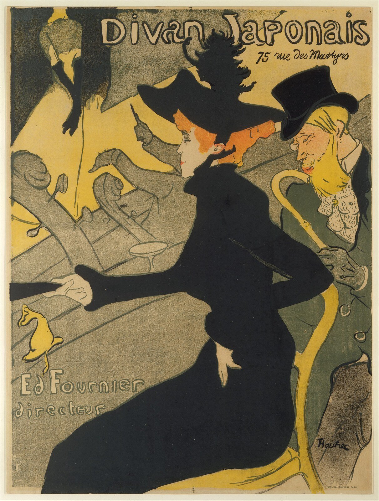
ANALYZE · TYPE AS IMAGE AND INFORMATION
Begin with observable organization. Large red and black letterforms occupy the upper field while figures, silhouettes, and cropped shapes organize the lower area. Text varies in scale, orientation, spacing, and placement.
Rights: the Met identifies the work and image as Public Domain and provides it through Open Access.
View the official Met object recordCHECK UNDERSTANDING
No. Pair-specific spacing is kerning. Tracking changes spacing across a range of characters.
No. Display usually describes intended use or character. A display face may also be serif, sans serif, script, or another structure.
No. Useful line length depends on typeface, size, leading, language, medium, audience, and purpose.
No. Visible characteristics and learned associations can contribute to tone, but context shapes interpretation.
CONNECT