ELEMENT 05 · RELATIVE LIGHT AND DARK
Value.
The relative lightness or darkness of a color or neutral.
Value is relational. We judge an area as lighter than, darker than, or similar to another area. Its appearance can change when the surrounding values change.
Value is not an “amount of black.” Every perceived color has relative lightness, and different hues can occupy similar value positions.
BEFORE YOU EXPERIMENT
Compare relationships before naming a tone.
Value describes relative lightness and darkness. It is easy to point to black and white at the ends of a scale, but most decisions in an artwork concern relationships among the tones between them. A gray square can seem lighter against a dark surround and darker against a pale surround while the square itself remains unchanged. In that case, the measurable color is stable and the comparison changes. This distinction helps you describe a visual effect without claiming that the pixels have been altered.
Suppose you design a museum label beside a large photograph. A pale text panel over a dark corner of the image may be clear, while the same panel over a bright corner nearly disappears. Increasing contrast locally can make the label readable. Darkening every part of the photograph might solve that one issue while flattening distinctions elsewhere. Instead, consider the label’s placement, a solid background, or a narrower range of values behind the type. The goal is a readable relationship in the actual context. Color alone does not guarantee it; different hues can have similar lightness. The Contrast lesson develops this comparison further.
Rembrandt’s The Three Crosses (ca. 1660) invites a different kind of value study. Begin at the deepest darks and locate the passages of light that hold your attention. Then look at the intermediate tones that connect or separate the groups of figures. You can reduce the scene to broad light, middle, and dark masses without pretending that all the smaller marks are identical. The Metropolitan Museum of Art holds this drypoint as object 41.1.33, Gift of Felix M. Warburg and his family, 1941. The museum marks its image Public Domain and provides the collection record with the analysis below.
A common error is to treat value as a percentage of black added to a color. Two colors can have similar lightness while differing strongly in hue, and a color’s surrounding field can affect its appearance. Another is to label every small difference as a separate value family. If your purpose is to explain the composition at a glance, grouping close tones may reveal its structure more clearly than listing every increment. Detail still matters when you return to inspect the transitions.
CONTROLLED DEMONSTRATION 01
The same gray can look different.
The two center squares are identical. Their surrounding fields change the comparison.
Both center squares: #777777
CONTROLLED DEMONSTRATION 02
A scale orders relationships.
Nine steps provide a practical instructional sequence from dark to light; they are not a claim of perfectly equal perceptual intervals.
CONTROLLED DEMONSTRATION 03
Group many values into three masses.
Value reduction groups numerous local light/dark differences into a few larger value families while preserving the major light–dark structure.
The composition does not change here. Every silhouette, crop, object position, and spatial relationship is identical; only the value assignments collapse into light, mid, and dark.
CONTROLLED DEMONSTRATION 04
Key describes where most values gather.
The composition stays similar while its range shifts toward light, middle, or dark values.
COLOR ALSO HAS VALUE
Different hues can share similar lightness.
The purple and green swatches differ in hue but are adjusted to a similar relative lightness. A grayscale check suppresses hue so their value relationship is easier to compare.
For text accessibility, visual impressions are not enough: calculate the contrast ratio of the actual foreground and background pair.
VOCABULARY
Organize light and dark precisely.
These terms distinguish a single comparison from the structure of an entire composition.
- Value
- Relative lightness or darkness.
- Value scale
- An ordered sequence from dark to light.
- Value range
- The distance between the darkest and lightest values used.
- Key
- The overall concentration of values in a light, middle, or dark range.
- Value contrast
- The difference in lightness between adjacent areas.
- Notan
- A historically situated design study of light and dark masses, not a generic synonym for every value study.
MANIPULATE · VALUE SCALE
Change the range and count the steps.
Step count changes how finely the interval is divided. Overall shift lightens or darkens every step while preserving the ordered relationship until an endpoint clips.
Compare adjacent steps for local contrast; compare the endpoints for overall range.
Comparison: seven ordered steps span the full dark-to-light range.
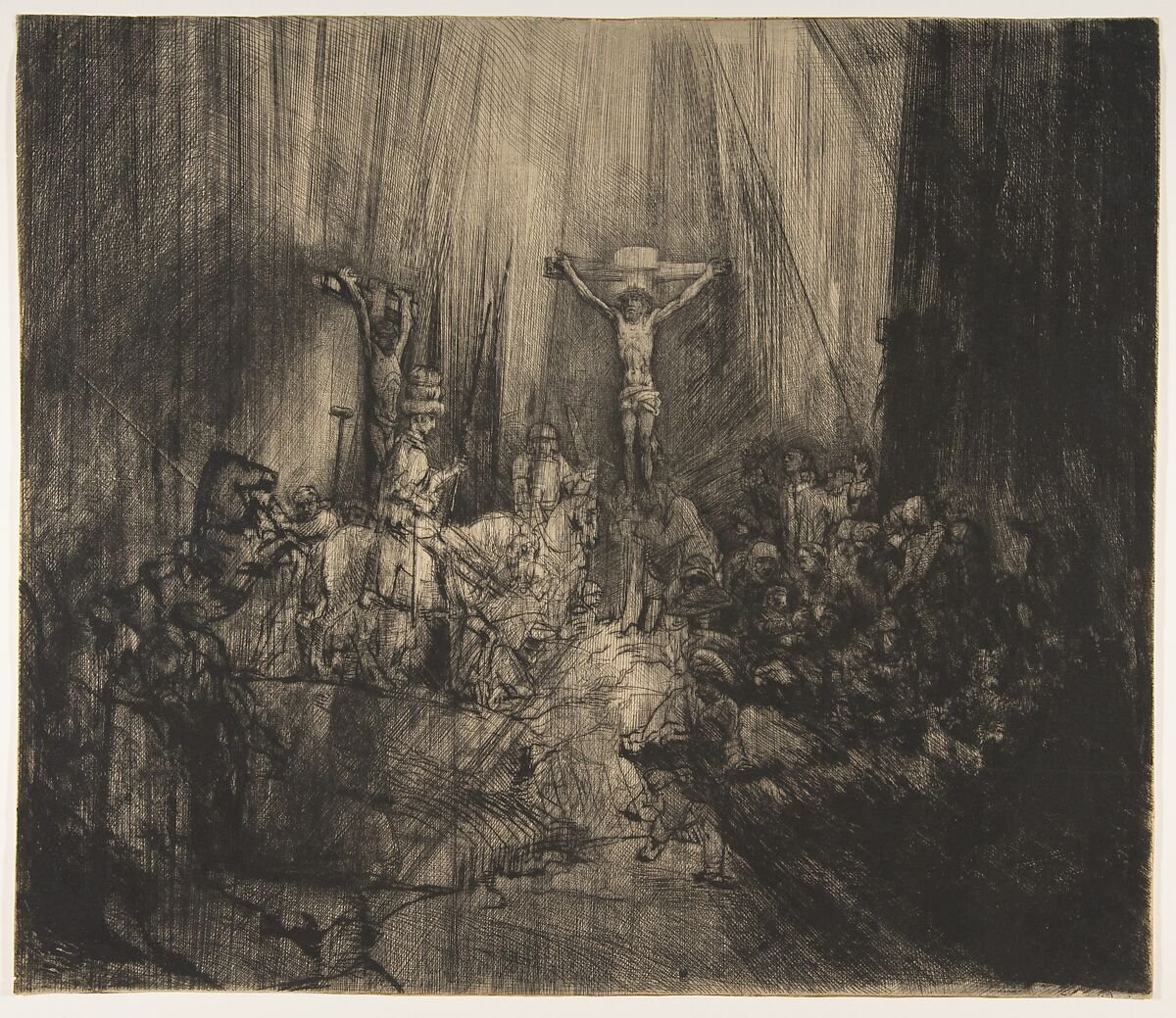
ANALYZE · OPEN-ACCESS COLLECTION
Christ Crucified between the Two Thieves: The Three Crosses
Begin with large light, middle, and dark masses before examining figures or individual marks. Dense drypoint and exposed paper establish the broad value structure.
- Where is the largest light mass?
- Which dark areas merge, and which retain visible internal variation?
- How does the value range affect edge clarity around the central cross?
Rights: The Met marks the object image Public Domain and permits unrestricted use of its open-access public-domain images.
View the official Met object record
COMPARE · VALUE ACROSS MEDIA
Rembrandt (1606–1669) as a Young Man
In The Three Crosses above, drypoint marks build darkness while the exposed paper carries much of the light. In this painting, the face emerges through small changes in painted value. The hat, coat, and background are all dark, yet they do not merge into one flat shape. Compare the different ways the two media preserve detail inside shadow.
- Find the lightest area and trace the values outward from it.
- Where can you still distinguish one dark surface from another?
- How does each work direct attention without outlining every form?
Attribution: the Met catalogs this painting as Style of Rembrandt, not as a work by Rembrandt. Rights: the image is Public Domain / Open Access.
View the official Met object recordCHECK UNDERSTANDING
Which relationship are you judging?
Two different colors become nearly identical in grayscale. What do they share?
They have a similar relative value, even though their hues differ.
A painting uses only pale grays but still separates adjacent shapes clearly. High key or low contrast?
It is high key. Its local contrast may still be sufficient; key and contrast describe different relationships.
Does visible contrast automatically satisfy WCAG accessibility requirements?
No. WCAG text contrast is a measured ratio for a specific foreground/background pair. Pictorial value contrast is related but not interchangeable.
CONNECT