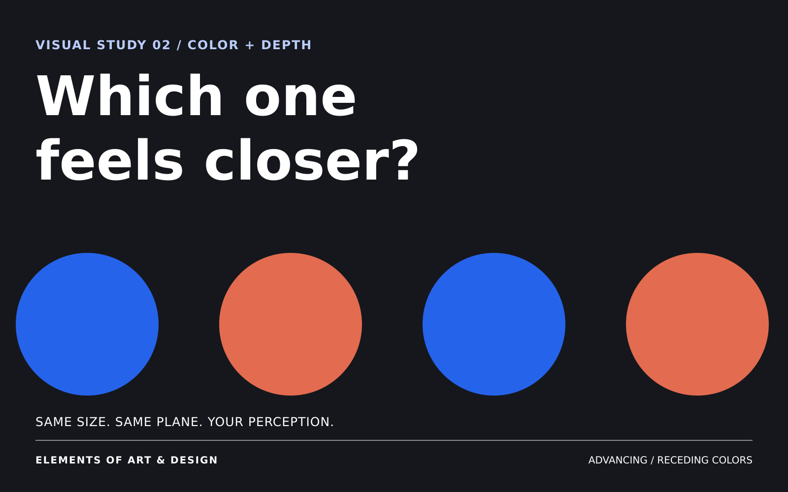
Two colors on the same flat surface can appear to be at different distances. You may perceive one as nearer and the other as farther away, even though both are printed on the same page or displayed on the same screen.
Artists describe these effects as advancing and receding colors. The terms name an apparent depth relationship. They are useful when you are comparing what you see in a particular image.
What are advancing and receding colors?
An advancing color appears relatively closer to the viewer; a receding color appears relatively farther away. In a flat image, that relationship is perceived. The ink, paint, or screen surface has not acquired another physical layer.
A familiar teaching shortcut associates warm hues with advance and cool hues with recession. Use it as a starting question. Hue operates alongside lightness, saturation, neighboring colors, and the other depth cues in the composition.
It also helps to separate visual prominence from apparent depth. You may notice an unusual or isolated patch first while still perceiving it as part of a flat surface. Ask “Which do I notice first?” and “Which seems nearer?” separately.
Begin with the surrounding field
Compare the two panels below. The blue patch keeps the value #2563EB in both; the coral patch keeps #E36B4F. Shape, size, and position also stay fixed. Only the field behind them changes.
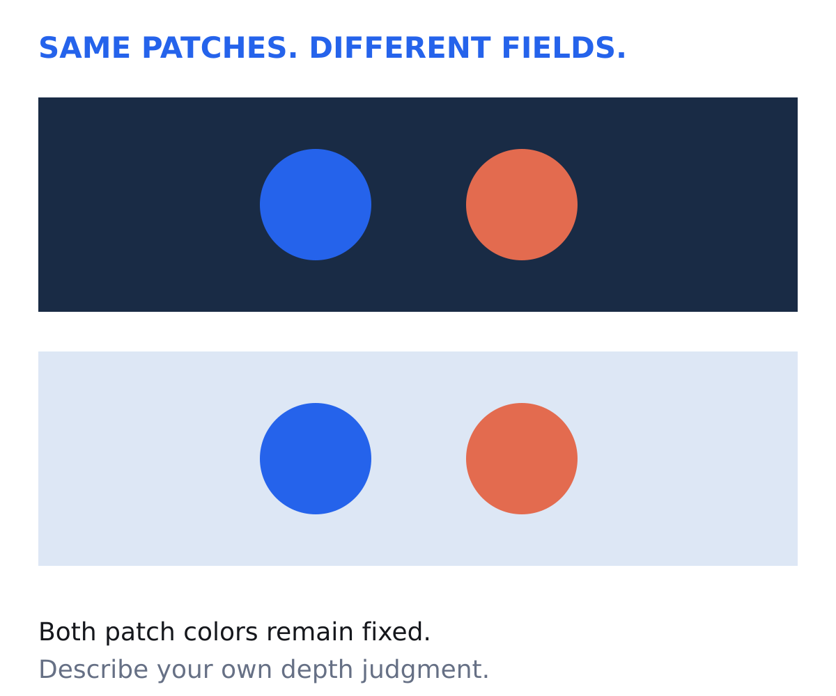
Does either patch appear closer on one background? Does a color seem more prominent without acquiring depth? A comparison is useful even when the answer is uncertain. It gives you a more precise description than a rule attached to the color name.
Research gives us good reason to attend to these relationships. In a 1994 experiment, Robert O’Shea and colleagues found that a lower-contrast area could appear farther away than a higher-contrast area against a background.1 In a separate 2014 study of colored shapes on gray, Birgitta Dresp-Langley and Adam Reeves found that saturation affected judgments of foreground and background, and that contrast polarity interacted with saturation.2
Our diagrams are informal viewing exercises. They do not isolate hue at equal measured luminance, nor do they reproduce those experiments. Your display, its settings, and your viewing conditions affect what is available to see.
Compare color with overlap
Compare the overlapping circles below. In the first panel, the blue circle partly covers the coral circle. In the second, the coral circle partly covers the blue circle. The colors, circle sizes, and center positions stay fixed.
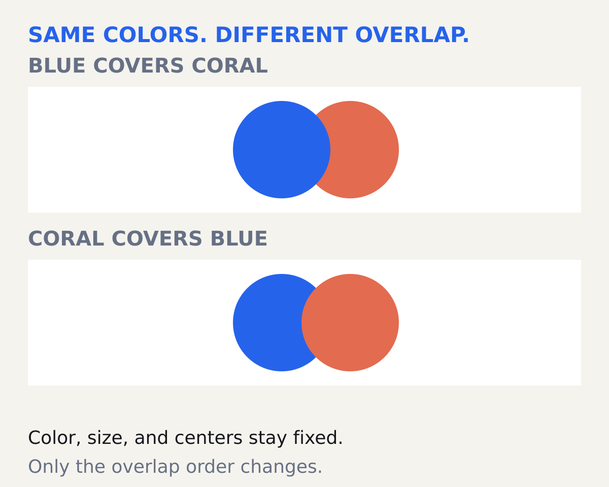
Look first: which circle covers the other in each panel?
Blue covers coral above; coral covers blue below. The overlap order changes while the colors remain fixed. This makes it possible to compare a clear contour cue with any depth impression you associate with the hues.
In a painting, several cues usually operate together. A cool shape can cover a warm one. A distant sun can be intensely warm. Color temperature alone does not locate every part of a scene.
A coastline complicates the shortcut
Claude Monet’s Low Tide at Pourville, near Dieppe, painted in 1882, gives us a useful place to look.3 Blue water occupies much of the foreground. Warm passages of cream and peach appear in the cliff farther back.
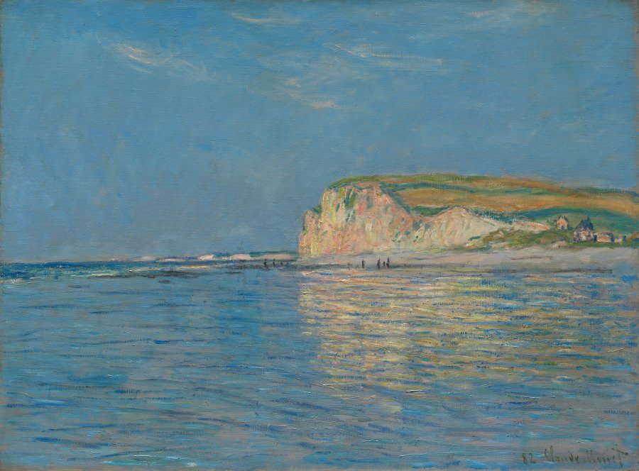
Compare the coastline, the small figures, and the arrangement of water, shore, and cliff. The warm cliff colors occur farther back in the depicted scene than much of the blue water. Here, you can assess color alongside other visible depth cues.
Look at the water on its own, then compare it with the whole composition. Examine the blue in the foreground, the reflected colors in the water, and the blue of the sky. Describe where the colors appear and how they relate across the scene.
Why red and blue can appear at different depths
Some red-blue combinations on screens produce a particularly striking apparent separation. A phenomenon called chromostereopsis can contribute to this: optical differences in how the eyes handle different wavelengths can produce binocular depth effects. Experimental work has also demonstrated a change in the direction of that effect when the pupils were partially covered.4
That is a specific mechanism. It does not explain every instance in which a painted color appears near or far. For most practical decisions, begin by describing the whole arrangement.
TRY THIS / FIVE MINUTES
Ask two separate questions.
Place two colored squares side by side. Keep their dimensions and positions fixed, and compare them against a light field and a dark field. For each version, record which you notice first and which seems closer. “Neither” is a useful answer.
Then make a second version in which one square overlaps the other. Reverse the overlap. Describe which relationship most changed your reading. Continue with the Color and Space lessons.
Sources and image credit
- O’Shea, Blackburn, and Ono (1994), “Contrast as a depth cue.” Vision Research 34(12), 1595–1604. DOI: 10.1016/0042-6989(94)90116-3.
- Dresp-Langley and Reeves (2014), “Effects of saturation and contrast polarity on the figure-ground organization of color on gray.” Frontiers in Psychology 5:1136. DOI: 10.3389/fpsyg.2014.01136.
- The Cleveland Museum of Art, object record 1947.196. Artwork identification, material, credit, and open-access permission.
- Ozolinsh and Muizniece (2015), “Color difference threshold of chromostereopsis induced by flat display emission.” Frontiers in Psychology 6:337. DOI: 10.3389/fpsyg.2015.00337.
Original diagrams and visual analysis: Neura Collective. Use these diagrams for observation; they are not calibrated laboratory stimuli.