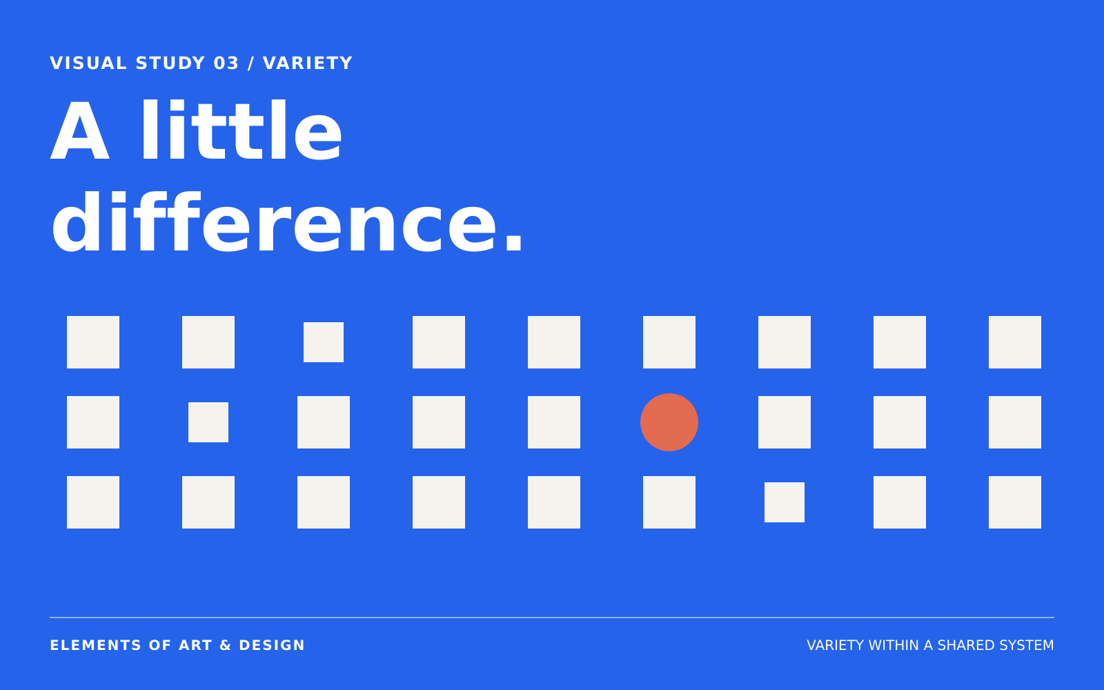
On a page with several heading styles, image shapes, and decorative details, you may have trouble deciding where to look first. Each item may be attractive on its own, but the differences can make the page harder to scan.
Before adding another style or image, compare the existing differences. Which are useful for the purpose of the page, and which make the information harder to follow?
What is variety in art and design?
Variety is the range of visual differences within a composition. Those differences can involve shape, size, hue, value, texture, direction, spacing, or type treatment.
In the elements-and-principles framework used on this site, variety is a principle: it describes how visual elements are organized. The Getty likewise includes variety among the principles of design.1 A shape is an element; a range of related shapes can contribute to variety.
It helps to name the range. “The design has variety” tells us less than “three image sizes are arranged on one grid” or “the flowers differ in contour while several pale blossoms form one light area.” The second kind of description gives you something to examine and change.
Keep one composition. Change the range.
The three panels below retain the same number of positions on the same grid. In the first, every square has the same treatment. In the second, size varies. In the third, shape, size, color, and orientation vary.
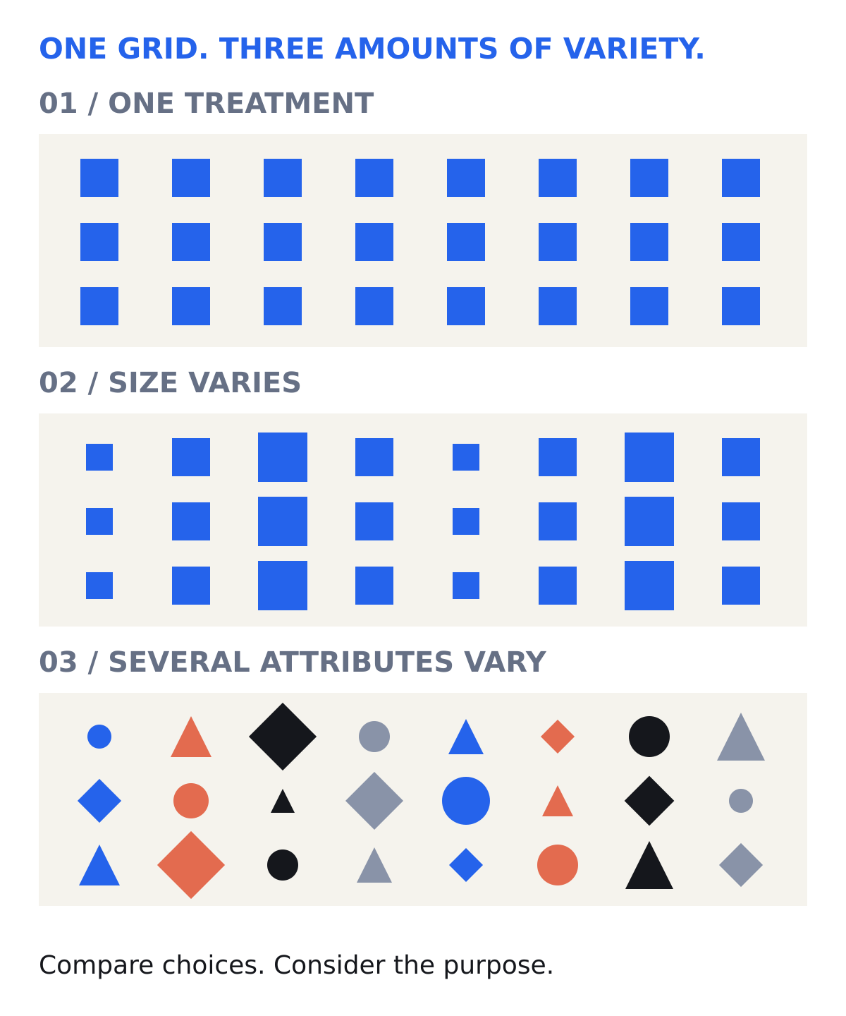
Imagine the panels as three proposals for a calendar, a poster, or a decorative fabric. Your judgment may change with the assignment. Consistent sizes and spacing might make dates easier to scan. A wider range might suit a poster meant to announce several kinds of activity.
These are possible uses, rather than findings from a user test. The comparison gives you a way to discuss a decision without declaring one amount of variety universally correct.
Describe what continues
Variation becomes easier to follow when some relationships continue. A set of images might differ in subject while sharing a crop ratio. Headings might vary in size while sharing a typeface, alignment, and spacing rule.
Look at the six squares below. Their sizes differ, but all six retain the same square shape and color. Their centers are equally spaced and horizontally aligned. You can compare the size differences within that consistent arrangement.
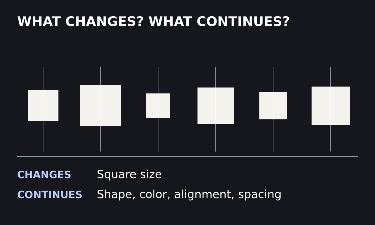
Look first: which attributes vary, and which remain shared?
Only square size varies. The square shape, color, center alignment, and center spacing remain the same. You can describe the change precisely because the comparison has a stable basis.
This offers a practical way to revise. If a layout feels scattered, choose one relationship to repeat more clearly. If everything feels undifferentiated, choose an attribute that can usefully vary. You are adjusting a relationship, and you can stop when it serves the work.
Look for larger relationships in a detailed painting
Jan van Huysum’s Still Life with Flowers and Fruit, painted around 1715, contains an extraordinary range of forms and surfaces.2 Compare a broad petal with a thin stem, a smooth grape with a folded leaf, or a pale blossom with a dark opening.
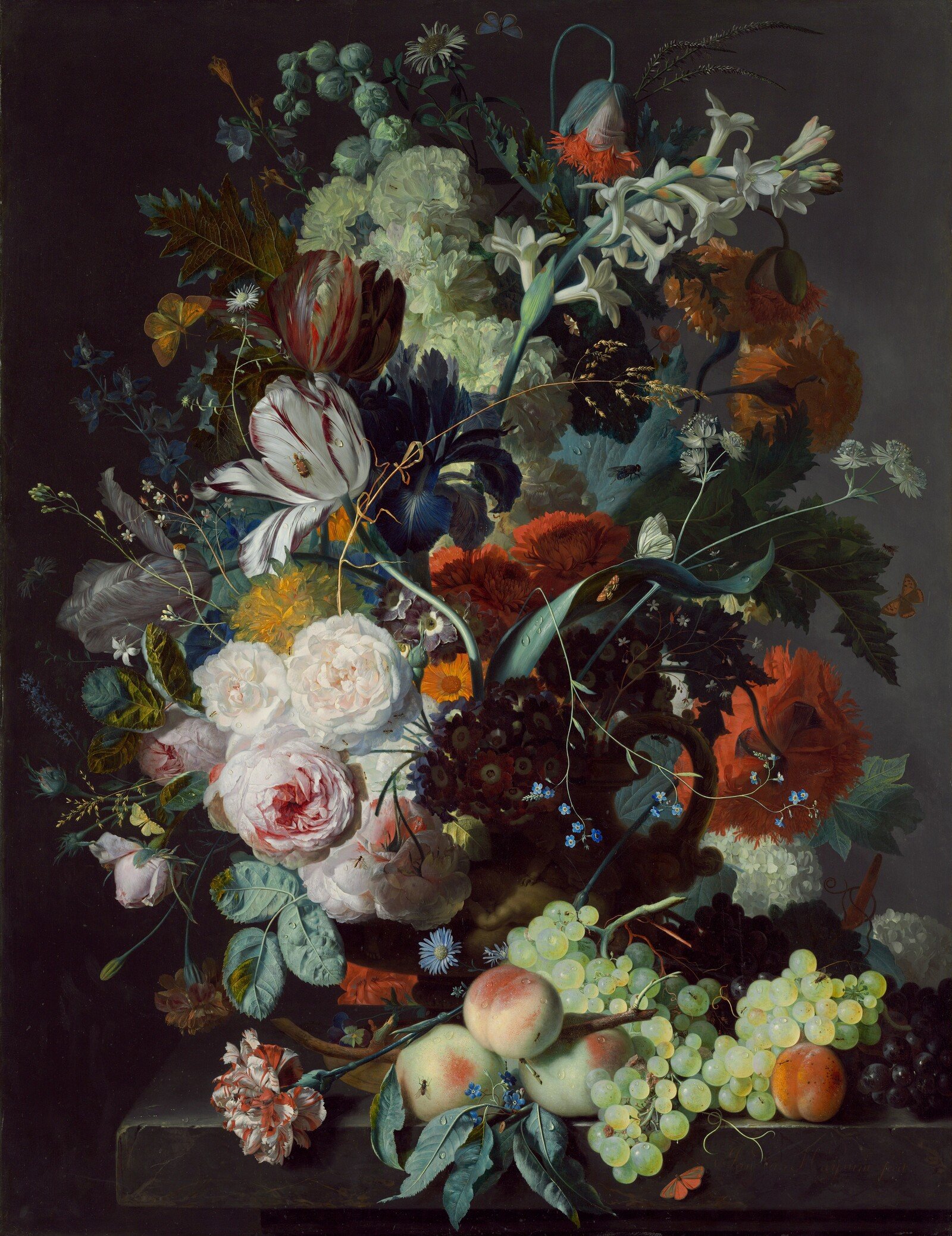
Now look for larger relationships that connect the details. The flowers are arranged above a vessel against a dark background. Several pale flowers form a prominent light area, while curving stems extend between neighboring forms.
This is a reading you can test against the reproduction. Cover a small cluster with your hand, then uncover it. Does the local difference change your sense of the whole? Step back from the image. Which larger areas of light and dark remain visible when the smaller details become harder to distinguish?
The exercise connects two scales of attention. Up close, you can examine many kinds of difference. From farther away, the distribution of light, dark, and density becomes more apparent.
Compare variety, contrast, and unity
Contrast describes a degree of difference between selected elements or areas. Variety describes the range of differences across the work. Unity concerns the coherence of the whole.
One coral circle among identical blue circles can produce a strong contrast while leaving most of the field uniform. Several related sizes can provide a wider range with a gentler distinction between any two neighbors. In either case, shared relationships may hold the composition together.
When you revise a design, those distinctions can keep the task manageable. You might need a clearer focal difference, a broader range, or a stronger connection among things that already differ. Choose an adjustment that addresses the difference you have identified.
TRY THIS / TEN MINUTES
Explain the purpose of each change.
Choose a small composition: a flyer, a photograph, or an arrangement of paper shapes. List three attributes that vary and three relationships that continue.
Make a second version with one fewer kind of variation. Make a third in which one attribute varies more strongly. Compare all three at the size people will actually see them. Describe what each version helps you notice, and whether that serves your purpose. Continue in the Variety lesson.
Sources and image credit
- J. Paul Getty Museum Education, “Landscapes, Classical to Modern” worksheet, “Principles of Design” section. The classification of variety within the principles framework.
- National Gallery of Art, object record 96655. Artwork identification, date, material, credit, and public-domain image status.
Original diagrams, practical examples, and visual analysis: Neura Collective. The comparisons illustrate choices, rather than establish a universal ideal amount of variety.