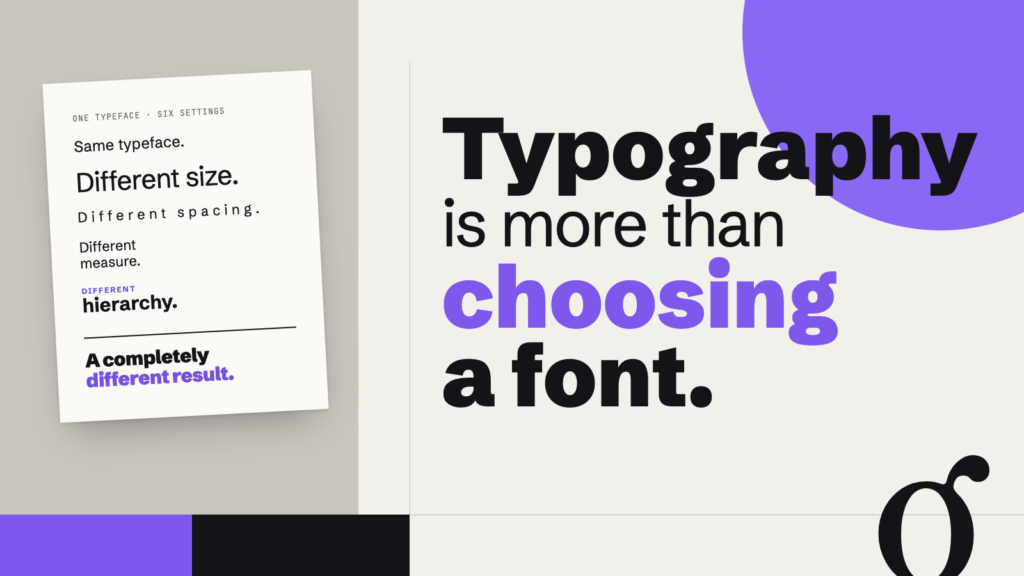
Two designs can use the same typeface and feel completely different. The difference comes after you choose the typeface.
Choose a typeface, type a paragraph, and the words appear on the page. At first, the major decision may seem complete.
But try changing the size. Narrow the column. Add space between the lines. Make one sentence larger. Change the alignment. Increase the space above a heading.
You have not changed the typeface, yet you have changed the typography.
Typography is not simply selecting letterforms. It is also the arrangement of those letterforms into words, lines, paragraphs, columns, and larger systems. Size, spacing, alignment, hierarchy, line length, weight, and proportion all contribute to how written language takes visual form.
Designer and educator Ellen Lupton’s Thinking with Type reflects this broader view. Its current edition moves from typefaces and type families into columns, line length, spacing, hierarchy, alignment, grids, and responsive layouts. The progression is useful because it shifts attention from the appearance of individual letters to the relationships that organize reading.
A typeface is only the starting point
The terms typeface and font are often used interchangeably in everyday conversation. For understanding typography, the more important distinction is between choosing the forms of the letters and deciding how those letters will behave on the page or screen.
Imagine setting the same paragraph twice in the same typeface.
In the first version, the heading is barely distinguishable from the body text. The column stretches across the page. Lines sit close together, and paragraphs crowd one another.
In the second, the heading has a clear relationship to the body. The column is narrower. Lines have room to separate, and paragraphs are visibly distinct.
The alphabet has not changed. The reading experience has.
Same typeface, different typography
Both examples use the same typeface. What changes when size, spacing, measure, and hierarchy change?
This is one reason judging a typeface from a specimen or font menu can tell you only so much. The typeface supplies the forms. Typography puts those forms to work.
Hierarchy gives language visual structure
Written information already contains relationships. A title introduces a subject. A heading identifies a section. A caption explains an image. Body text develops an idea.
Typography can make those relationships visible.
Size is one method. Weight, position, spacing, case, style, and color can also distinguish one level of information from another. Often several of these work together.
More contrast is not automatically better. If every heading is enormous, every important phrase is bold, every label is in uppercase, and every secondary idea has a different treatment, the distinctions begin to compete with one another.
A useful hierarchy creates differences that readers can recognize without requiring every element to shout.
Lupton treats hierarchy as a structural problem as well as a stylistic one, including both minimal and layered hierarchies in the current edition of Thinking with Type.
Space is part of typography
The empty areas around letters and lines are not leftovers. They help determine the shape and texture of a block of text.
Kerning adjusts space between particular pairs of characters. Tracking changes spacing across a range of characters. Line spacing, traditionally called leading, controls the vertical distance between lines.
Paragraph spacing, margins, indents, and the spaces surrounding headings also contribute to the larger rhythm of a page.
Change one of these and the letters remain the same, but the text block changes.
Very tight line spacing can make successive lines difficult to distinguish and may cause ascenders and descenders to crowd one another. Very loose spacing can weaken the visual connection between lines that belong to the same paragraph. Between those extremes lies a wide range of possibilities shaped by the typeface, size, line length, medium, and purpose.
Space changes reading
These paragraphs contain the same words in the same typeface and size. Only the line spacing changes.
Rather than looking for a universally correct setting, compare how easily your eye moves through each version.
Accessibility adds another consideration. Current W3C guidance requires web content to remain usable when users override authored spacing, including increasing line, paragraph, letter, and word spacing. Importantly, WCAG does not say that every site must use those override values as its default typography. The requirement is that content should not break when readers adjust spacing to meet their needs.
Line length changes the reading experience
A line of text can be too long for comfortable continuous reading. The eye travels across the line and then has to locate the beginning of the next one. Extremely short lines pose a different problem: frequent line breaks interrupt the flow of a sentence.
This dimension is called measure, or line length.
No single measure fits every typographic situation. Type size, line spacing, language, typeface, medium, and text length all matter.
For web interfaces, the U.S. Web Design System currently recommends roughly 45 to 90 characters for most lines and identifies about 66 characters as a useful target for long text. It also explicitly notes exceptions: larger type may benefit from shorter measures, short passages can tolerate measures outside the usual range, and greater line spacing can make longer measures easier to follow. These are working guidelines, not a law of typography.
Measure changes the page
The text is identical across all three columns; only the width changes.
Compare a narrow measure, a moderate one, and a very wide one. Notice not only how they look as shapes, but what your eyes have to do while reading them.
Weight creates relationships
Bold type attracts attention partly because it differs from what surrounds it.
That last part matters.
A bold word inside a page of regular text can be conspicuous. A bold word inside a page where nearly everything is bold has much less to contrast with.
The same principle applies to size, color, italics, capitalization, and other forms of emphasis. Their effect is relational.
This is why repeatedly adding emphasis can eventually reduce it. When too many elements demand attention at once, the reader has fewer cues for deciding where to look first.
Before making something louder, look at what surrounds it. Sometimes the better solution is to make something else quieter.
Alignment changes the shape of text
Alignment does more than move text to one side of a box.
Flush-left text creates a consistent left edge and an irregular right edge. Centered text produces irregular edges on both sides. Flush-right text reverses the familiar left-edge structure of English and other left-to-right writing systems. Justified text creates even left and right edges by varying spacing within lines.
Each produces a different visual shape and different practical consequences.
Justification, for example, can create compact rectangular text blocks, but poor combinations of column width, type size, word length, and spacing can produce distracting gaps. Centered text can create strong formal compositions for short passages but becomes a different reading problem in long paragraphs.
Even accessibility standards treat alignment with some nuance. WCAG 2.2 includes, at its AAA level for visual presentation, a provision allowing users to obtain blocks of text that are not justified on both margins. That is different from declaring justified typography universally forbidden.
The question is not simply, “Which alignment is correct?”
It is, “What does this alignment do to this text?”
Typography has to survive the real world
A composition does not always stay where it was designed.
A web page may move from a wide desktop display to a narrow phone. A presentation may be projected across a room. A poster may also appear as a tiny social-media image. A book page may be reproduced on a screen.
As the available space changes, typography may need to adapt accordingly.
A headline that works beautifully across a wide screen may break awkwardly on a phone. A comfortable desktop line length can become irrelevant once the viewport narrows. Navigation labels may wrap. Enlarged text may collide with containers that were designed too rigidly.
Responsive typography, therefore, involves more than simply shrinking everything proportionally. Relationships have to survive the transition.
This is also an accessibility issue. W3C guidance requires text spacing adjustments to work without clipping or overlapping content, and its implementation guidance specifically recommends testing responsive layouts when spacing is overridden.
Try changing one thing
Choose a paragraph and set it in one typeface. Then leave the typeface alone.
Change the width of the text block and compare the result.
Return to the original and change only the line spacing.
Return and introduce a heading. Try creating hierarchy with size, then with weight, then with space.
Change the alignment.
Try the paragraph at a much narrower screen width.
Each time, change one variable and look again.
You may find that some adjustments make an immediate difference while others are barely noticeable. The point is not to discover one perfect set of settings. It is to become more aware of the relationships that shape the text.
Look beyond the font menu
A typeface can be elegant, awkward, restrained, exuberant, familiar, or strange. Choosing one matters.
But the choice does not finish the job.
Typography emerges when letters are given size and space, when lines acquire length, when paragraphs form shapes, and when different kinds of information are organized into relationships.
The next time a piece of typography does not seem to be working, resist the urge to choose another font immediately.
Look at the relationships first.
Continue exploring
Visit Typography in the Elements curriculum to explore letterform anatomy, type classification, hierarchy, alignment, spacing, measure, and other aspects of typographic structure.
For a deeper exploration, Ellen Lupton’s Thinking with Type examines typography from letterforms and type families through spacing, hierarchy, grids, alignment, and responsive layouts. The fully revised third edition was published by Princeton Architectural Press in 2024.
Explore Thinking with Type by Ellen Lupton on Amazon →
Affiliate disclosure: This page contains an affiliate link. If you make a purchase through it, we may earn a commission at no additional cost to you.