A color does not appear alone. Change its surroundings, and what you think you see can change.
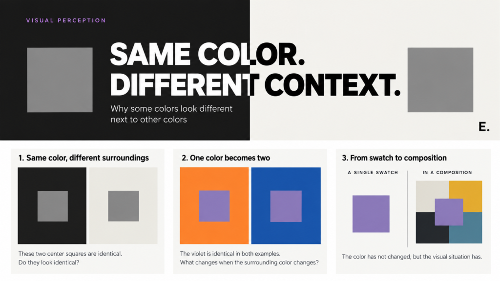
Put the same gray square on two different backgrounds, and something interesting happens. Against a dark background, the gray may look lighter. Place it against a light background, and it may look darker. The gray itself has not changed. Only its surroundings have.
This simple experiment reveals one of the most useful insights about color: we see colors in context. What sits beside a color, surrounds it, or competes with it can affect how we see it.
Color is relational
It is easy to think of color as a fixed property. A particular red can be described with measurable values. A digital color might have an exact RGB or hexadecimal value, and those numbers remain the same wherever that color appears.
Our perception is less fixed. Lightness, hue, saturation, area, and neighboring colors all contribute to the visual experience. A color that seems quiet in one composition can become conspicuous in another. A neutral can appear warmer or cooler depending on what surrounds it.
For artists and designers, this means choosing a color is only part of the decision. Its context matters too.
Same color, different surroundings
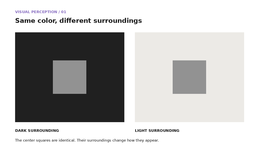
These two center squares are identical. Do they look identical?
The medium-gray squares in this demonstration have exactly the same value. Their backgrounds are different. Comparing them in place, and then without their surrounding fields, reveals how much context shapes their appearance.
Your eye compares
Vision does not simply record individual colors one at a time. Our visual system responds to relationships and differences across the visual field. Put a medium gray against black, for example, and it may seem surprisingly light. Move that same gray onto white, and it can seem noticeably darker, even though the gray itself has not changed.
Color can also affect our perception of neighboring hues. These effects are often discussed under the term simultaneous contrast, which refers to how colors can influence one another when we see them together. For an artist or designer, there is an immediate practical consequence: an important color should be evaluated in the context where it will actually be used.
Josef Albers made this a way of learning
Artist and educator Josef Albers made the interaction between colors central to his teaching. Instead of simply asking students to memorize color systems, he gave them exercises that required careful observation. Students compared colors, changed their surroundings, and watched apparently stable colors behave unexpectedly.
Those investigations became the basis of Interaction of Color, first published in 1963. Albers explored perceptual effects such as making one color appear as two, making different colors appear similar, creating apparent transparency, and changing the apparent qualities of colors through their surroundings.
The Josef & Anni Albers Foundation continues to teach this experimental approach. One of its workshops, One Color Becomes Two, asks participants to place the same color to different grounds and observe how its appearance changes.
There is no need to decide in advance what you are supposed to see in an experiment like this. Look carefully at the first arrangement, change one variable, and compare it with the next.
One color becomes two
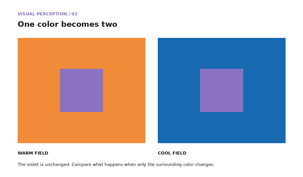
The violet is identical in both examples. What changes when the surrounding color changes?
The effect may not look exactly the same to every viewer. Compare the two appearances before checking the colors themselves.
From the color picker to the finished design
A color selected from a picker is usually viewed under controlled conditions, often against a white, gray, or transparent background. Once that color becomes part of a finished design, its surroundings affect how it appears. A violet button surrounded by charcoal may look brighter than it did in the picker. Place it inside a field of saturated blues and the same violet may become much less conspicuous.
This happens throughout visual work. Text interacts with its background, colors in paintings affect adjacent passages, and packaging competes with other colors once it reaches a store shelf. Illustrations, photographs, presentations, and data visualizations all create similar relationships. Looking at individual swatches is useful, but eventually you have to judge colors together.
From swatch to composition
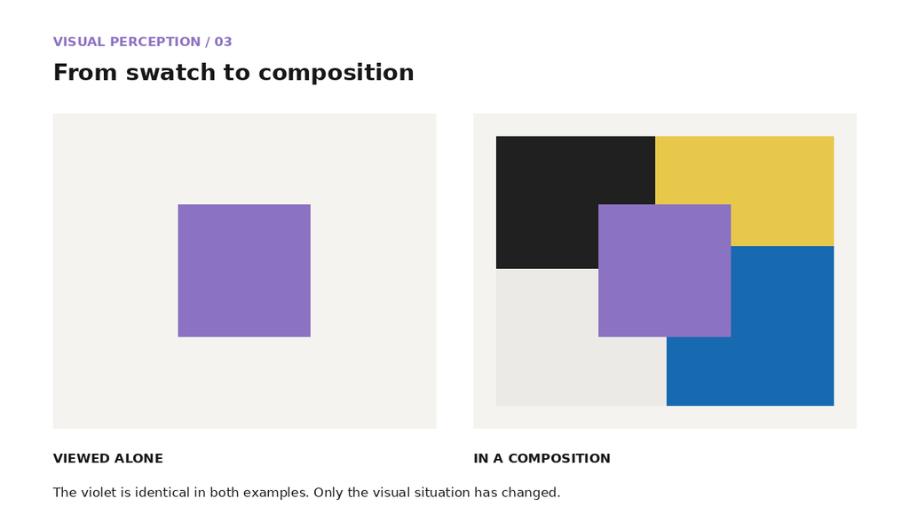
A single violet swatch makes it easy to inspect the color on its own. Put that same violet into a composition with several neighboring colors, and you have more to evaluate. The color has not changed, but the visual situation has.
Try changing one thing
You can test these effects without special materials. Choose a small colored square and place it on a larger background. Keep the small square unchanged while you alter only the background.
Begin with a lighter background, then a darker one. Try warmer and cooler surroundings. Compare muted colors with highly saturated ones. Place the sample near related hues and then against strongly contrasting hues.
Look at the sample after every change. Does it appear lighter or darker? Warmer or cooler? More intense or more subdued? You may notice a strong shift in some combinations and very little in others.
Changing one variable at a time makes it easier to see which relationship produced the effect.
What the color wheel cannot show
A color wheel tells us where hues sit in relation to one another. It can help us find a complement or identify a group of neighboring hues, but it says nothing about how much of each color will appear in a composition. It also leaves out many of the changes we can make to lightness and saturation.
Consider blue and orange. A small orange shape surrounded by blue will not have the same visual effect as a composition divided equally between the two colors. Make the orange paler, darken the blue, or reduce the saturation of either, and the relationship changes again.
This does not make the color wheel less useful. It simply means identifying a hue relationship is the beginning of a color decision, not the end.
Look at the surroundings
When a color seems wrong in a painting, layout, interface, photograph, or illustration, changing the color itself may not be the best first move. Look at what surrounds it. Adjust a neighboring color, the background, the relative area, or the contrast in lightness and compare the result. You may find that the first color works perfectly well once its context changes.
Continue exploring
Visit Color in the Elements curriculum to explore hue, saturation, lightness, traditional color relationships, RGB, CMYK, HSL, warm and cool colors, and the interactive color wheel.
For a more thorough exploration of Josef Albers’s approach to color, the Josef & Anni Albers Foundation provides material about Interaction of Color and Albers’s teaching exercises.
Explore Interaction of Color at the Josef & Anni Albers Foundation